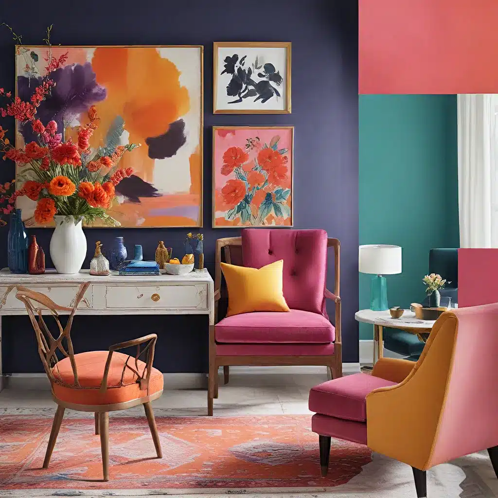
In a world where beige and neutral tones often dominate the interior design landscape, there’s a growing demand for homeowners and design enthusiasts to embrace bold, vibrant color palettes. These dynamic hues have the power to transform a space, infusing it with personality, energy, and a touch of luxury.
As we explore the latest design trends and uncover the benefits of incorporating bold colors into our homes, it’s time to shed our fears and unlock the true potential of color confidence.
Unleashing the Power of Color
Color is not merely an aesthetic choice; it’s a strategic tool that can evoke specific emotions and set the tone for an entire living space. Vibrant palettes have the ability to command attention, spark creativity, and leave a lasting impression on both the homeowner and their guests.
Urban Grace Interiors, a leading interior design firm, recognizes the transformative power of color. “When clients come to us, they’re often hesitant to step outside their comfort zone and experiment with bold hues,” says the firm’s founder, Sarah Grace. “But once they see the dramatic impact a vibrant color scheme can have on their home, they’re hooked.”
Embracing Your Brand’s Personality
Just as color psychology plays a crucial role in branding, the same principles apply to creating a harmonious and visually striking interior. By understanding the emotions you want to convey and the personality you wish to reflect, you can curate a color palette that truly resonates with your personal style and design aesthetic.
“Spring personalities are often drawn to bright, warm, and playful color palettes,” explains Sarah Grace. “These shades evoke a sense of youthfulness, creativity, and enthusiasm, which can easily be translated into a stunning home design.”
On the other hand, winter personalities may gravitate towards cool, intense, and dramatic hues, such as deep blues, rich purples, and sleek blacks. These bold and sophisticated tones lend themselves well to modern, minimalist, or luxury interiors.
Mastering the Art of Color Coordination
Selecting the right color combinations is crucial to achieving a cohesive and visually appealing design. While individual preferences play a role, understanding color theory and the seasonal personality of your brand can guide you towards a harmonious palette.
“One of the most common mistakes we see is homeowners trying to incorporate too many colors without a clear plan,” says Sarah Grace. “The key is to focus on a core set of complementary hues and then use accent colors to add depth and interest.”
| Seasonal Personality | Color Palette Characteristics |
|---|---|
| Spring | **Warm, bright, light, and fresh** colors with a **yellow undertone**. Think sunny yellows, vibrant greens, and punchy pinks. |
| Summer | **Cool, delicate, and muted** colors with a touch of **grey**, creating a **romantic and dreamy** feel. Soft blues, pale greens, and dusty lavenders are common summer hues. |
| Autumn | **Warm, intense, yet muted** colors with **earthy undertones**. Rich oranges, deep reds, and cozy browns evoke a sense of **coziness and comfort**. |
| Winter | **Cool, strong, and intense** colors with a **blue undertone**. Pure blacks, crisp whites, and bold blues or purples convey a **dramatic and luxurious** aesthetic. |
By aligning your color choices with your brand’s seasonal personality, you can create a cohesive and visually captivating design that resonates with your desired audience.
Exploring Bold Color Combinations
Once you’ve identified your seasonal palette, it’s time to start experimenting with bold color combinations. Don’t be afraid to step outside the box and push the boundaries of traditional design.
“One of our favorite ways to incorporate vibrant colors is through the use of statement walls,” shares Sarah Grace. “Whether it’s a moody blue accent wall or a cheerful yellow backdrop, these bold choices instantly transform a space and set the tone for the entire room.”
Another trendy approach is to embrace the monochromatic look, where you play with various shades and tints of the same hue. This creates a harmonious and visually striking effect, perfect for those seeking a more modern and minimalist aesthetic.
Innovative beauty brands have also embraced the power of bold color in their product offerings, inspiring homeowners to experiment with similar daring palettes. From electric eyeshadows to vibrant blush hues, these trends can easily be translated into interior design, encouraging homeowners to step out of their comfort zones and embrace their color confidence.
Balancing Bold with Neutrals
While vibrant colors undoubtedly make a statement, it’s essential to strike a harmonious balance with neutral elements to prevent the design from feeling overwhelming.
“Our clients often worry that incorporating too much color will make a space feel cluttered or chaotic,” says Sarah Grace. “But by strategically pairing bold hues with grounding neutrals, you can create a visually stunning and cohesive design.”
Stacy Garcia Inc., a renowned design firm, highlights the importance of finding the right balance between color and neutral elements. “The key is to use bold colors as accents and to let neutral foundations, such as white walls or natural-toned flooring, anchor the space,” the firm explains.
This approach allows homeowners to experiment with daring and expressive hues, while maintaining a sense of sophistication and visual harmony throughout the interior.
Embracing the Confidence to Transform
As we’ve explored, bold color palettes have the power to transform a living space, injecting it with personality, energy, and a touch of luxury. By understanding color psychology, aligning your choices with your brand’s seasonal personality, and striking a harmonious balance with neutral elements, you can unlock the true potential of color confidence.
Whether you’re drawn to the vibrant and playful shades of spring or the dramatic and sophisticated tones of winter, embracing bold colors in your home design can be a truly transformative experience. So, take a deep breath, step outside your comfort zone, and let your color confidence shine through, creating a space that truly reflects your unique style and personality.

